

The Challenge
RyeCatcher, a non-profit dedicated to building communities of support around students in need and tracking interventions, is mainly accessed through a browser application by teachers. Teachers use the tool to gain situational awareness of their students, communicate with their support circles, and track behavioral progress.
However, as classroom digital tools move to tablet, RyeCatcher needs a mobile app that allows teachers to track in real time.
We began by spending time with RyeCatcher’s desktop version, taking note of existing interactions on each page. We created site maps, user flows, and a feature matrix to understand how a user moves through the tool when completing a task.
The client also provided us a list of tasks that the user should be able to complete in the mobile version. We evaluated which would be most important in a mobile setting, and shared notes and rankings in our feature matrix.
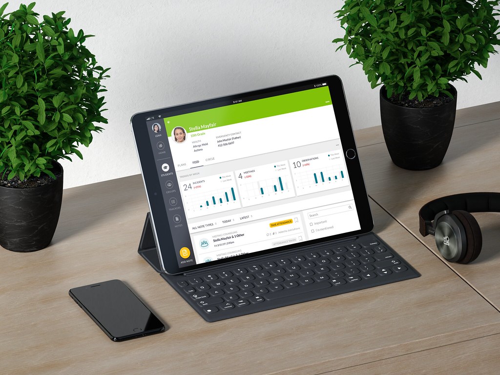
The Outcome
After spending time with RyeCatcher’s desktop version, taking note of existing interactions on each page, we created site maps, user flows, and a feature matrix to understand how a user moves through the tool when completing a task. The client also provided us a list of tasks that the user should be able to complete in the mobile version. We evaluated which would be most important in a mobile setting, and shared notes and rankings in our feature matrix.
These informed the design of RyeCatcher Mobile.
Design Imperatives
With consideration for the client and users, we developed four imperatives for our solution early on:
1. Provide means for anticipation. If teachers can get information about students before they see them, they can avoid incidents and trauma caused by misunderstandings.
2. Help teachers take action in real time. Teachers juggle many different hats, and often don’t have the time to fully document incidents. The faster and simpler we can make this process, the more accurate and useful the documentation will be.
3. Avoid information overload. “Some users have to deal with 40 kids at a time,” as one user put it. Our solution wll be most effective if it helps them to parse which information is most important first.


Stakeholder Interviews
We then had a chance to speak with RyeCatcher CEO Arthi Krishnaswami and Director of Growth and Partnerships Steven Lam, who acted as user proxies thanks to their deep familiarity with user behavior. We asked them questions based on what we observed with the current platform to get a better sense of what users needed out of a mobile app.
From them, we learned of two larger buckets of users:
The 80%
Teachers and other staff who are noting student behavior in real time. These users frequently rely on analog methods of documentation before inputting behavior notes when they get a spare moment.
The 20%
Administrators and counselors looking for more in-depth analyses of student behavior. Although these users spend less time interacting with RyeCatcher, they have longer sessions and utilize more of the features.


Scenarios
To get a better sense of how RyeCatcher Mobile might really be used, we developed five diverse use case scenarios, and presented them to one another for critique and refinement. From them, we developed some important questions for our user sessions.
Key Discoveries
The notes are not just for record-keeping; by publishing them in real time, other teachers may see them and act appropriately with students concerned when they encounter them.
There is potential value in bringing highly active students to the front of view automatically, thus preventing teachers from having to rely on scrolling and searching.
Outside of the app itself, push notifications could be valuable for keeping teachers on schedule.

Exploring a variety of use cases set the groundwork for our app map. We focused on (a) keeping all as many controls accessible at all times, and (b) minimizing the number of taps necessary to reveal a given bit of information.

Concept Generation
At this point, we divided our efforts in wireframing, each taking a set of pages to focus on and planning to make similar features consistent across pages later. My primary domain was the landing page, navigation bar, and feed. Once our individual work was complete, I coordinated with teammates to make sure our pages shared a common design language.


We then prepared and conducted two extensive user testing sessions, the insights from which contributed to our final iterations. In preparation for these sessions, we tried a role-playing exercise.
The intention was to get an accurate time and adjust questions, but we instead discovered a useful research activity: by embodying a user persona, we generated an important discussion about what was discoverable about our product.
We used the outcomes of our role-played user session to fuel assumptions to test in our actual user session.
The user session was then efficiently conducted and very valuable. We presented our findings to the client, who clarified our insights by highlighting overall trends among the broader user base.
Click here to view our research presentation.


Refinement
Click here to view our final presentation.
Final Wireframes
Our final product is feature rich for the 20%, but kept these features secondary in discovery, so that our 80% users could efficiently accomplish their tasks.
Click here to view our full annotated wireframes.
After exploring many potential color palettes, we eventually came back to a bold green, as we felt that the purpose of RyeCatcher was to promote growth and nourishment for students.

Reflections
What was helpful
The process of doing a research protocol roleplay was surprisingly effective. In particular, it was useful for testing a scenario we hadn’t yet considered, and revealed new problems that we were able to address prior to our precious time with users.
What has the most potential
The client seemed particularly intrigued with the added bookmarking function, and wondered about ways this could be incorporated into a way to follow specific students.
The key takeaways
Overall, our process as a team went smoothly, but as this was our first deep dive into UX for screens, we got ambitious and spread ourselves thin by incorporating several new features. In reality, we probably would have rolled these out more slowly in order to test and refine each.
Given more time…
Given the number of functionalities we added that don’t currently live on the platform, we’d have to see how well they’d work with RyeCatcher’s recently updated backend framework. We’d also like to see what potential push notifications and integration into other schedule management apps might have, and how they could be implemented effectively.


